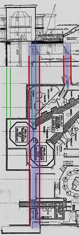
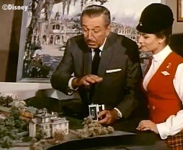
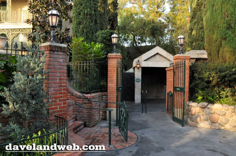
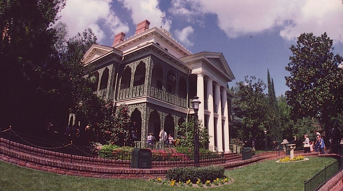
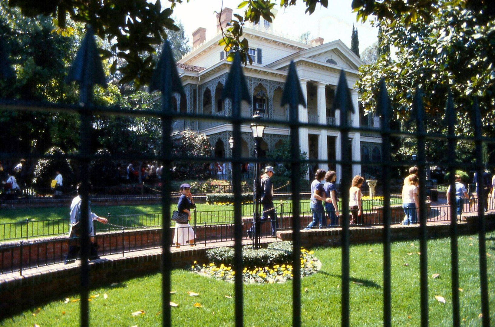
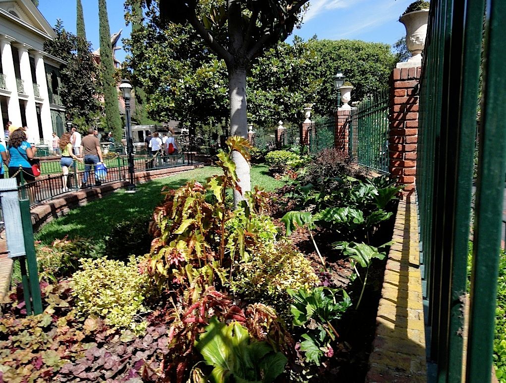
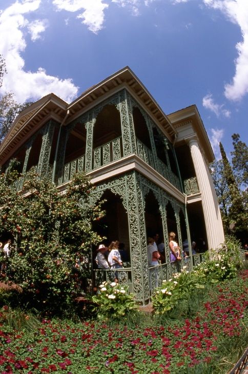
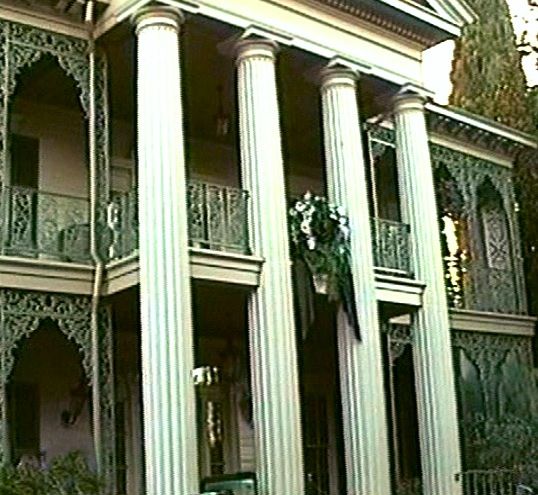
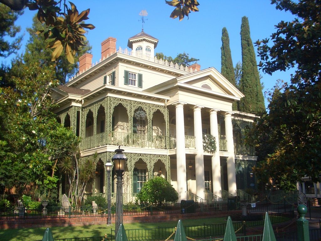
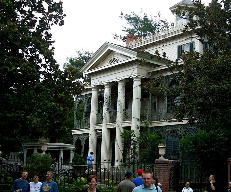
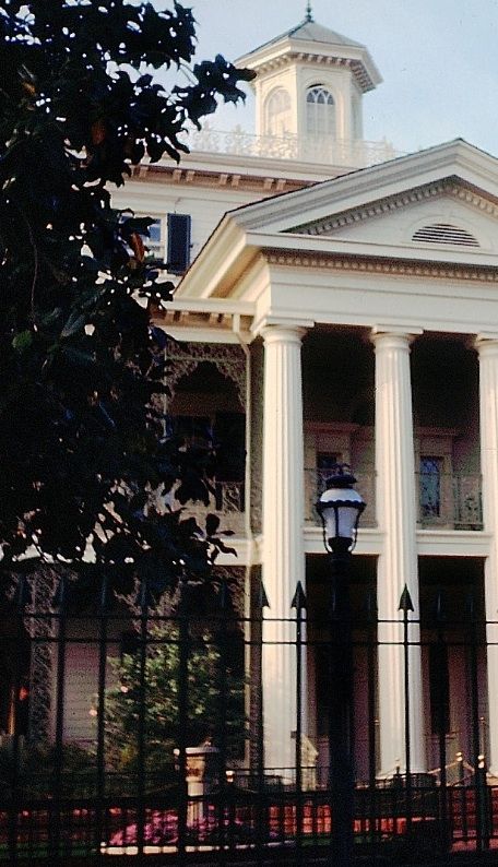
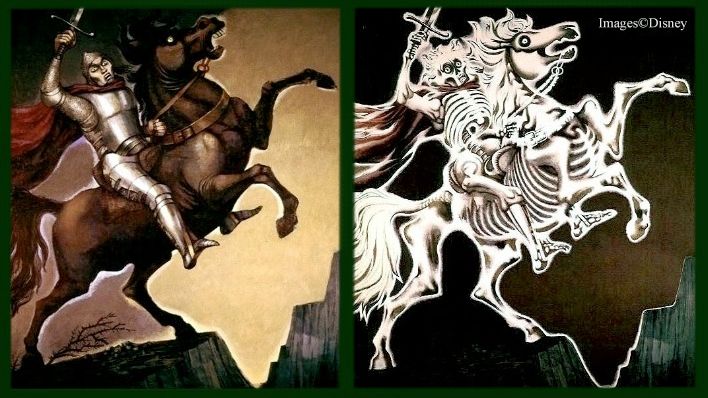
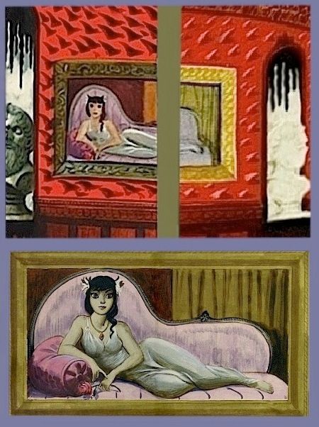
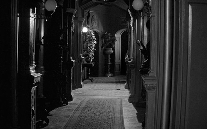
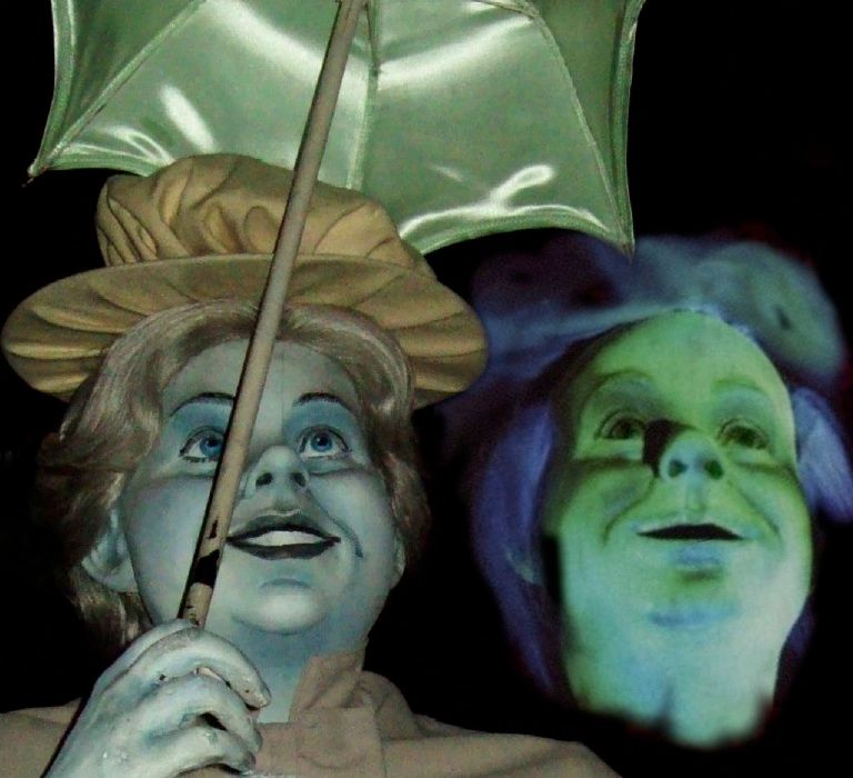
. We're still strolling around
that magnificent front yard
at the Disneyland Mansion,
and I've put together another
potpourri of mini-posts, a
bunch of things interesting
enough to share, but not
necessarily worth in each
case an entire post to itself.
This time out the common
theme is intentionality,
and furthermore, all of the
items to be discussed are
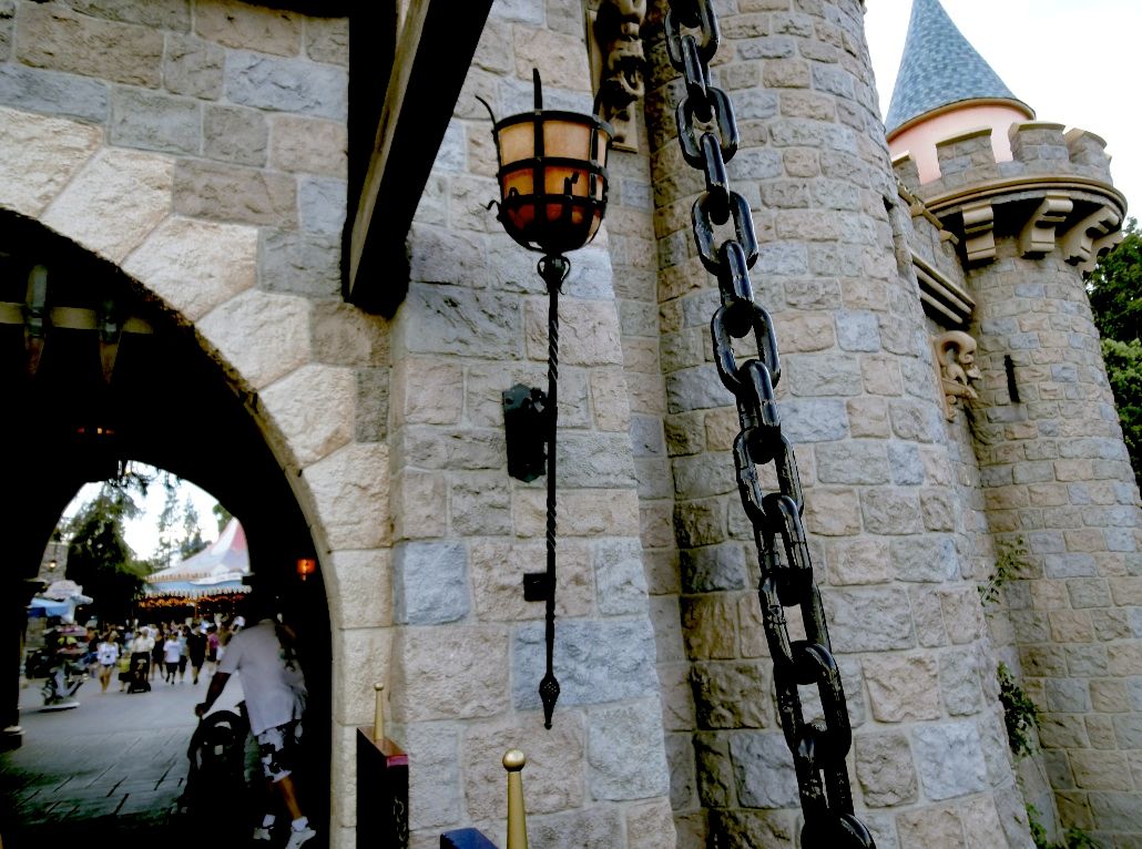
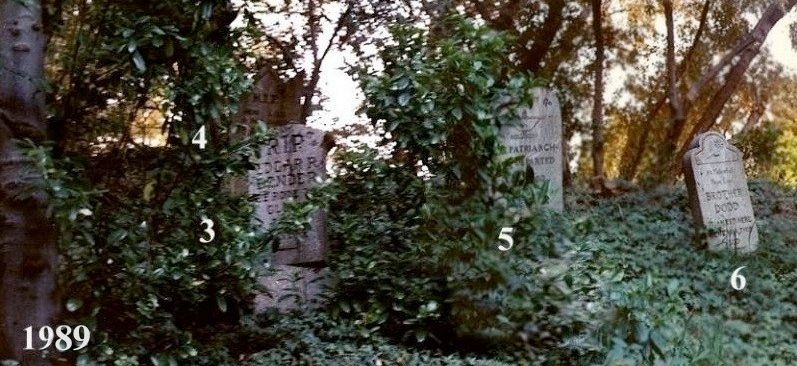
props that have been seen
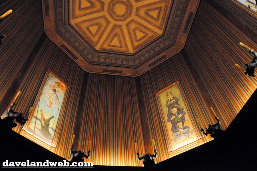
out on the upper balcony
of the Mansion (with one
exception).
What exactly did the
Imagineers intend for you
to take away from these
details? In some cases, did
they intend anything at all,
or is it your imagination,
hmm? And how much does
it matter what they intended,
anyway? All this and more,
coming right up.
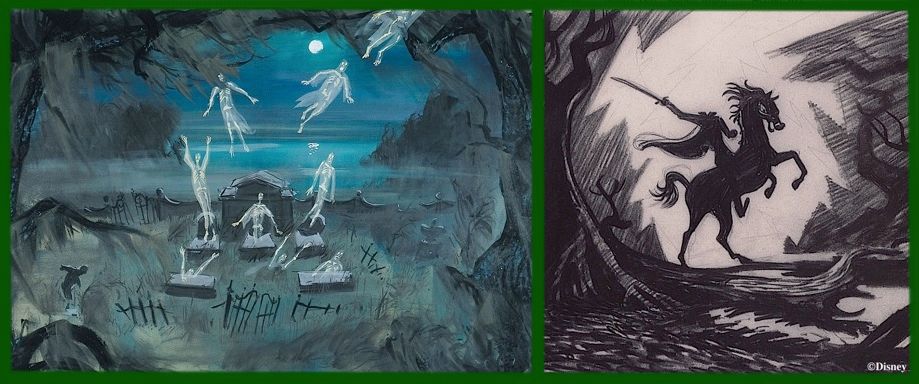
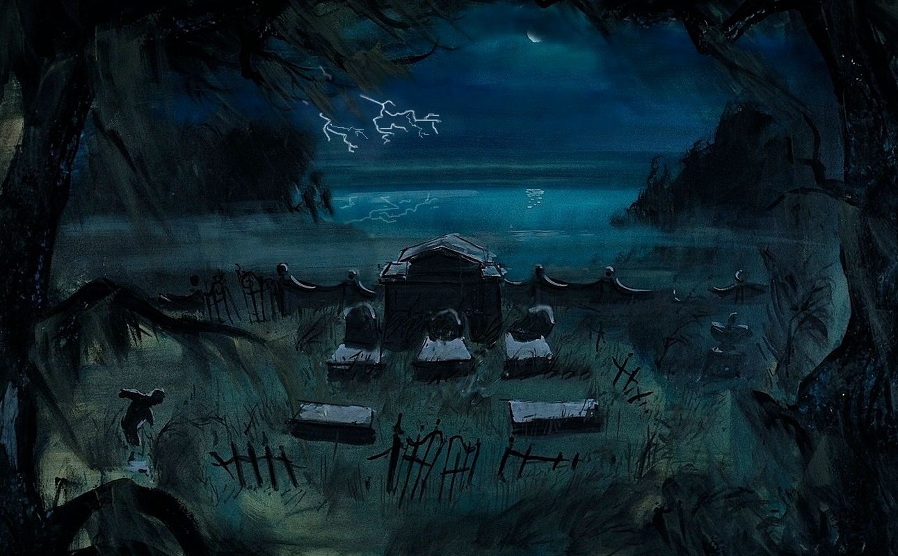
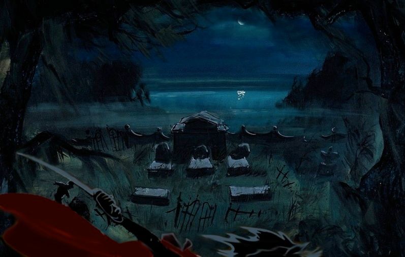
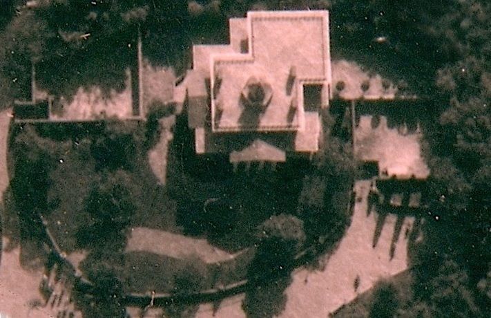
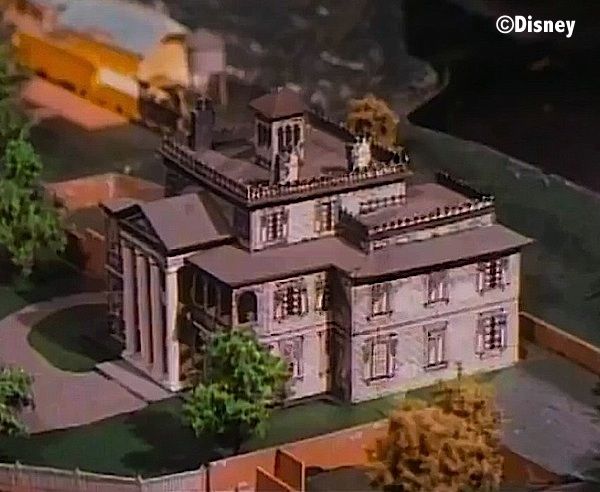
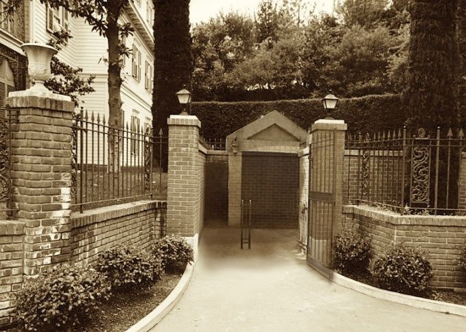
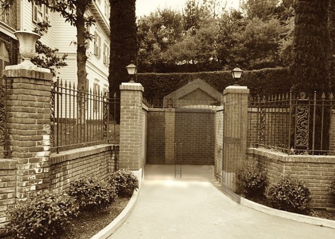
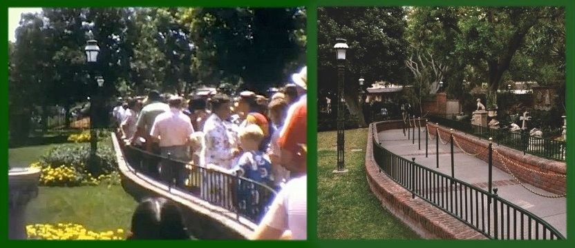
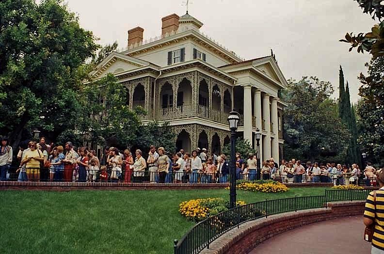
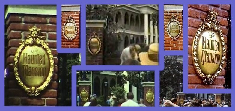
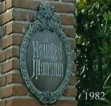
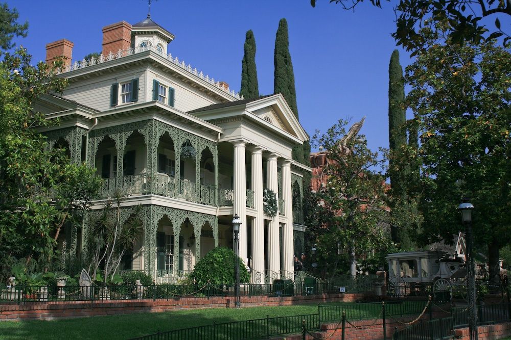
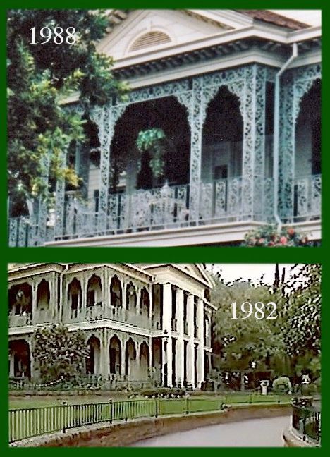
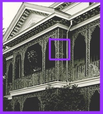
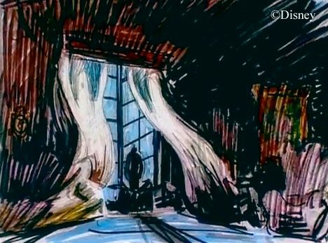
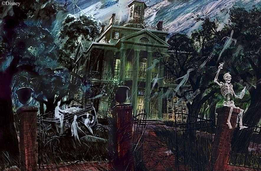
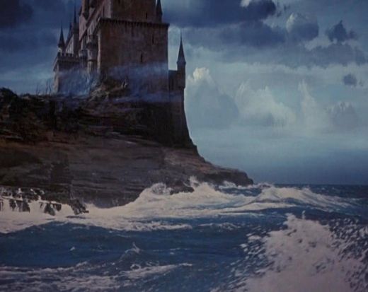
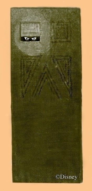
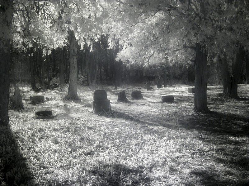
The Mansion
1990-1992
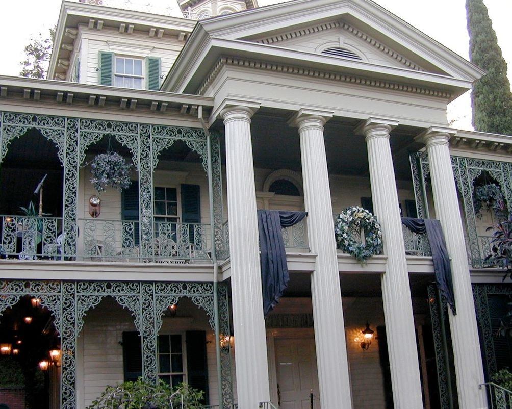
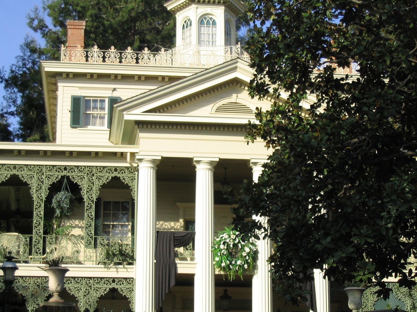
. In 1993 a funeral wreath with some modest, old-fashioned bunting sprouted among the columns out in front, but it didn't stay there
. very long. This brief appearance is today little remembered, being overshadowed at the time by the debut of the pet cemetery.
Maybe they were testing the waters or something. It came down and stayed down for 1994 and the first part of 1995 and then went back up,
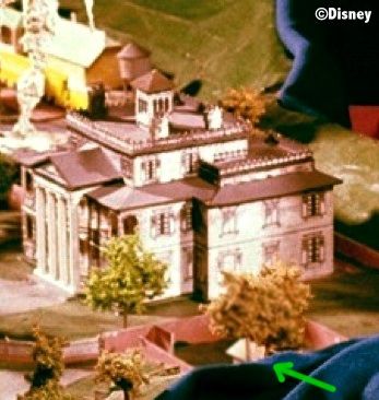
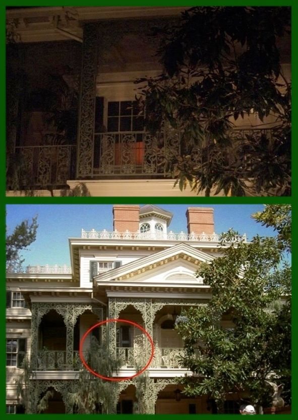
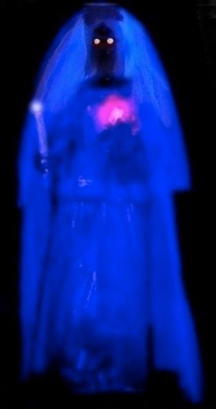
this time with more conspicuous bunting. A few years later, sometime in the latter part of 1997, a telescope appeared on the railing, with a barometer on the wall behind it.
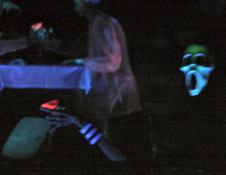
These were pretty overt offerings from WDI, and guests were expected to engage with them at some level. I liked them just fine, because they gave you no help at all, just like real life. With regard to the wreath and bunting, a host of questions come to mind. Does someone still live here, and did a relative of that someone just die? Or did the owner die, and the staff were instructed to put up the wreath and bunting in the will, perhaps? Or did the staff do this on their own, for one of their own? And why the old-fashioned, 19th-century bunting and wreath display? Are we seeing someone's antiquarian or eccentric tastes at work? Or if we're willing to countenance a more supernatural explanation, since ghosts
do exist in the world of the Mansion (its sole fantasy feature), is it possible that these items are (gulp)
apportations from the past?
This is exactly as it should be. You don't
have to think about this stuff at all, of course. The show is not diminished in any way if you don't. But if you do, you can come up with four or five possible explanations for the wreath and bunting, none of which require you to leave this world for a fantasy world. There isn't enough information to decide among the options. As I said, it's just like real life. You may have noticed that the world is not especially eager to explain itself to you as you pass by. You have to figure it out yourself, boys and girls, and often you don't have sufficient data, and that's just how it is. Now finish your sandwich and stop that whining.
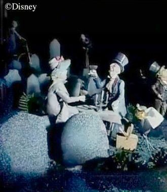
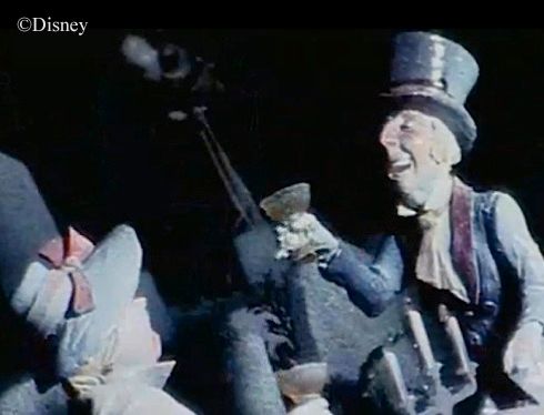
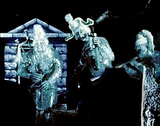
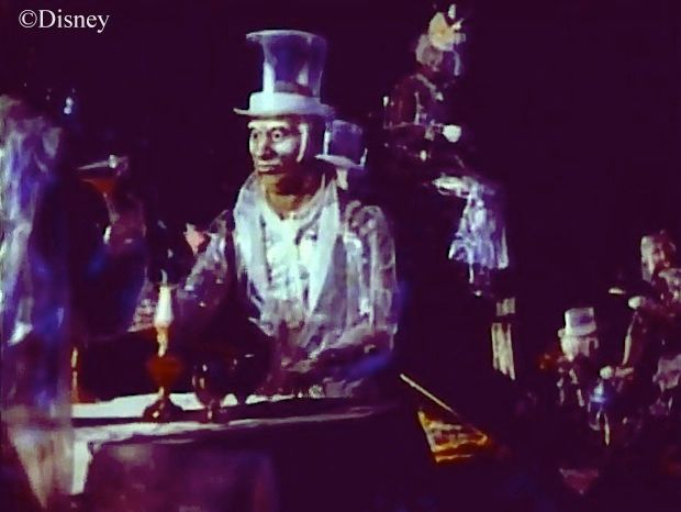
Yes, and what about that staff, anyway? I've come to accept the Butlers and Maids as part of the show rather than theme park noise to be screened out. After all, the house is well-kept, the candles are lit, the yard is immaculate.
Someone must attend to the place, unless you're prepared to put all this down to supernatural activity. I'll concede that the latter option is
possible in the world of the Haunted Mansion, but for me, lawn-mowing ghosts just don't cut it. Barring that, how do we square the presence of this staff with a house given over to ghosts, operating a retirement home? You don't get the impression that any mortal actually
lives there. Who would want to do that? It's a haunted freakin' house.
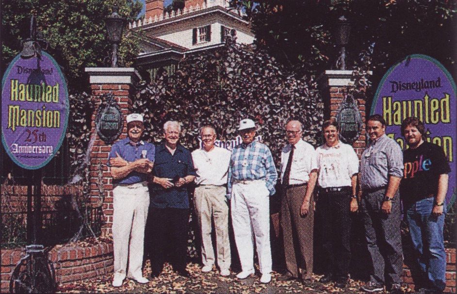
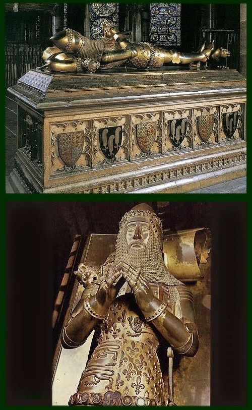
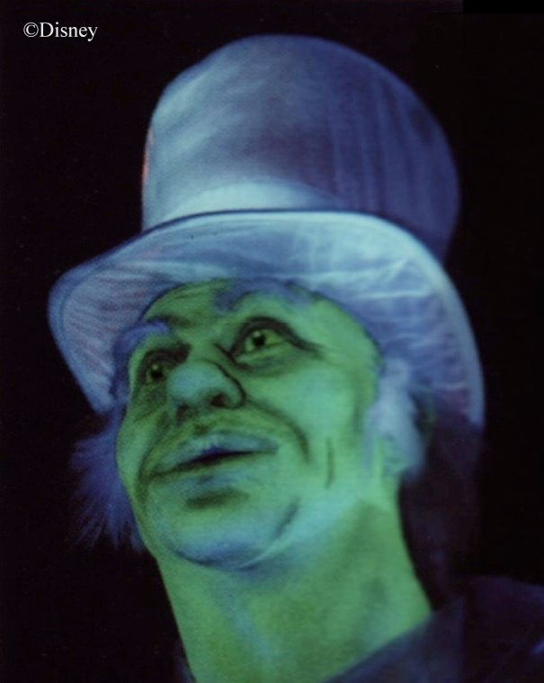
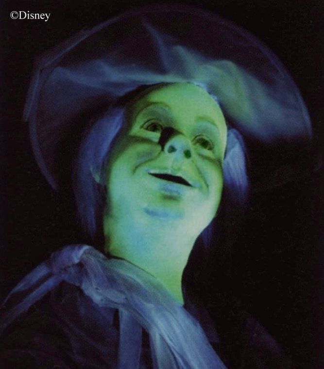
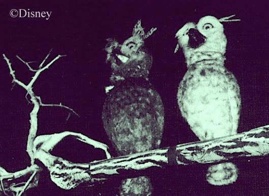
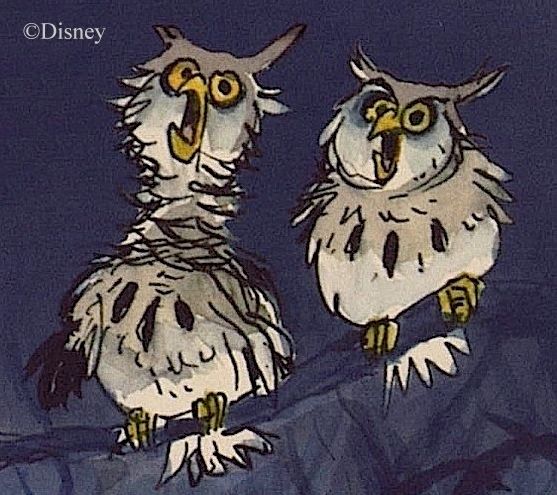
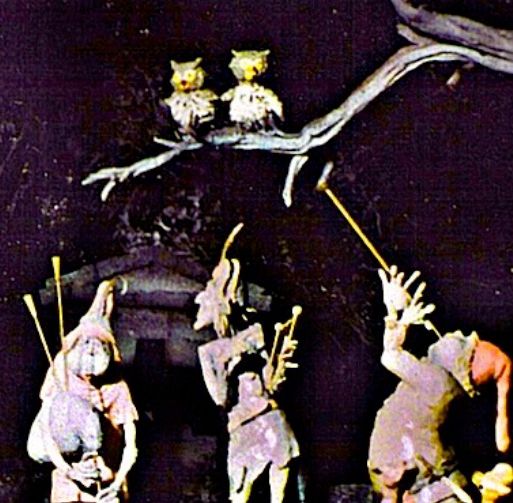
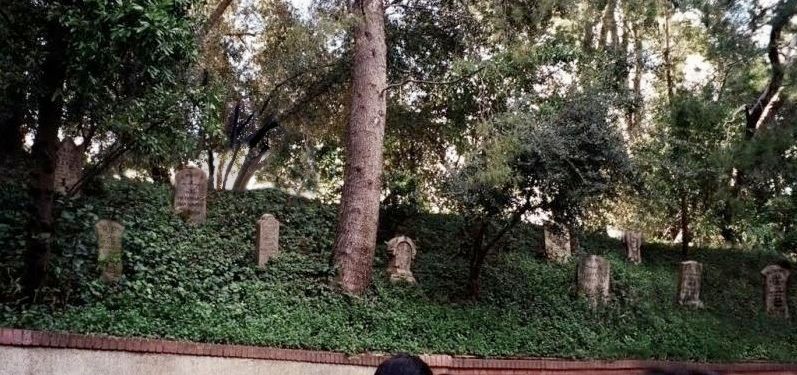
A 1969 photo of seven of the original 43 Butlers and Maids
Again, we're given very few clues. You never see any of the staff on the second floor, and there is evidence of complete neglect up there. Cobwebs are everywhere. It's easy to imagine a staff willing to keep up the grounds and the first floor but refusing to go upstairs. Too creepy, too scary, perhaps. It's bad luck. There's a curse. Whatever. No one goes up there unless it's absolutely necessary.
But where does this staff come from? Your guess is as good as mine, but it's perfectly possible to account for them. Maybe one of the last owners created an endowment that pays a lot of money in interest, funding a trust managed by a steward who hires enough staff to keep the place up, as per the trust fund agreement. Perhaps there is also a cozy relationship with the city (something to do with the endowment) so that an alderman keeps the stewardship position filled, which is in the city's interest anyway since they don't want the house to become a crumbling eyesore. The nearest relative, the actual owner of the building, is presently unknown. That's a mess no one wants to bother with until they really have to. They'd rather wait until the legal owner just shows up some day and claims the place, seeing as how the endowment has been paying handsome dividends, and the current arrangement has been increasingly lucrative for both the steward and the city. So the unoccupied house is kept up nicely (or nicely enough) in perpetuity. There is no "evidence" for any of this, but it shows that what you see is entirely explicable within this real world. They give you no help in figuring this out, and why should they? What business of yours is any of that? Go away.
The bunting and wreath far outlasted the other second-story exterior additions. We can cover this ground quickly. (Just enjoy the purdy pictures.) Wreath and bunting were both still there in the first part of 2004...
...but the bunting came off later in the year.
I've got a photo dated "January 2005" showing the bunting hanging out again, while other early 2005 pix don't show it. Either the photo is misdated, or they were putting it up and taking it down more casually and more frequently than I would have expected. At any rate, in 2005 the wreath was removed to make room for a big spider web to mark Disneyland's 50th anniversary:
The web was just a cute, temporary decoration, of course, and after it came
down in 2006, the wreath went back up and lasted for a few more years:
It was finally removed in 2009, when the HM celebrated its 40th anniversary, and so far it has not returned.
All and all, it was a nice long run for an intriguing prop with a deliberately ambiguous message.
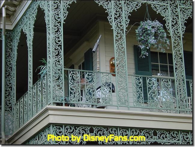
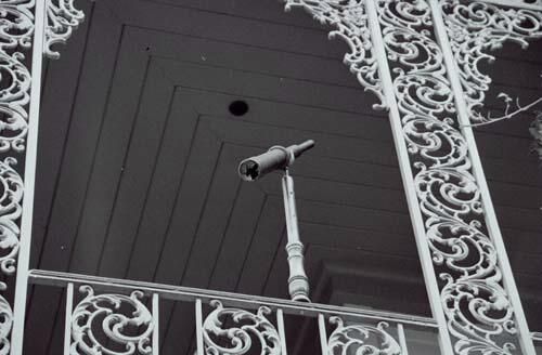
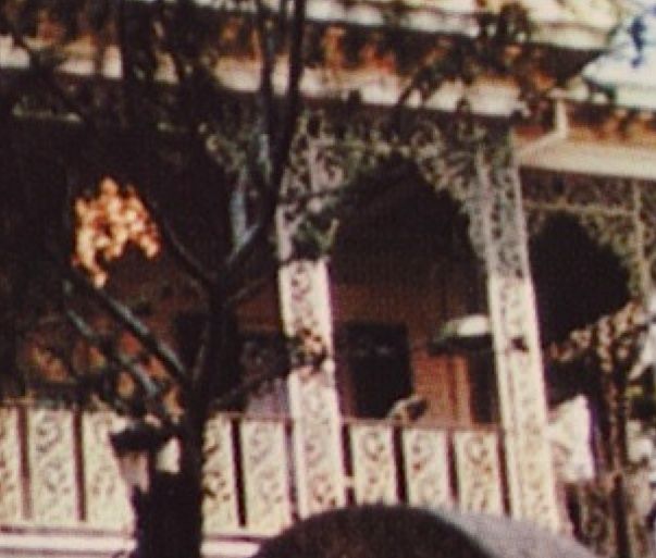
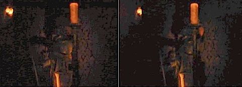
. Keeping a Weather Eye Open
. The telescope and barometer that debuted in 1997 did not survive the first Haunted Mansion Holiday in 2001.
. What a shame. I think the telescope added something special and was the best of these second-floor additions.
(pics by Allen Huffman)
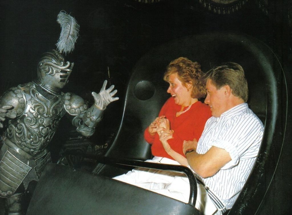
Every Mansion fan knows about the original "Sea Captain" backstory nowadays, but in 1997 very few did, so the fact that these relics point back enigmatically to that old concept was tantamount to an inside joke among Imagineers at that time. I suppose that 10,000 guests noticed the telescope for every one who noticed the barometer on the wall behind it. The fact that WDI didn't care about that discrepancy is, again, to their credit. Reality is that way. The telescope was a great prop, genuinely intriguing, inspiring questions without answers and suggesting that there were stories to this old place that you just didn't know. And don't you wish you did! Also, it was hard to look at it and not imagine someone looking through it, but of course no one was there. See? Those cunning Imagineers practically had you creating ghosts in your own mind.
Lemonade in the Shade
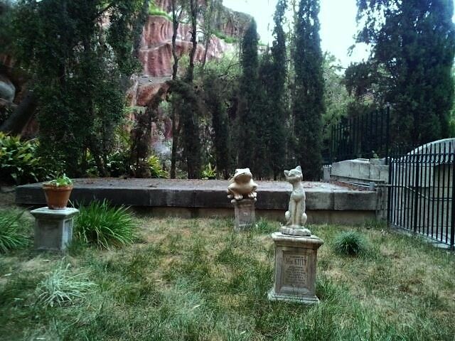
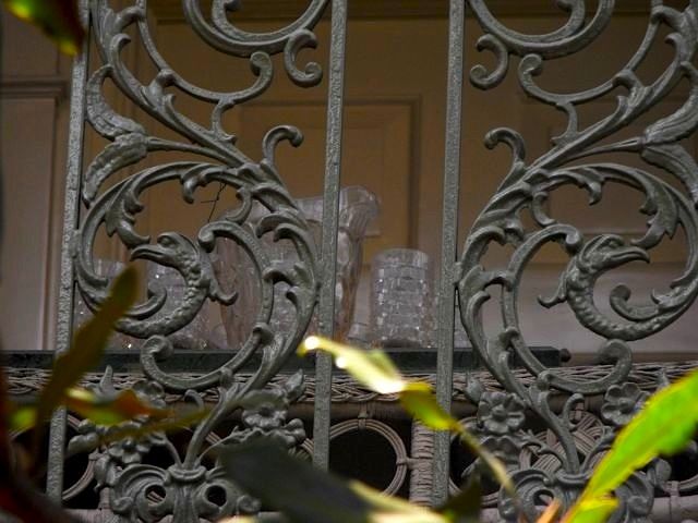
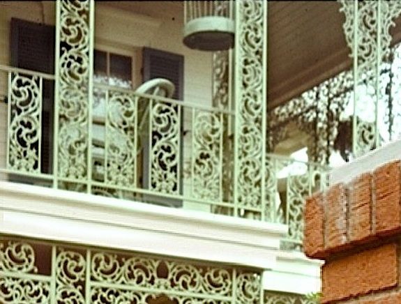
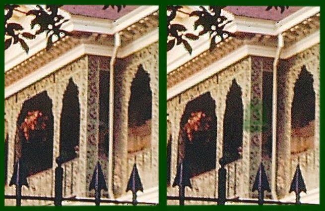
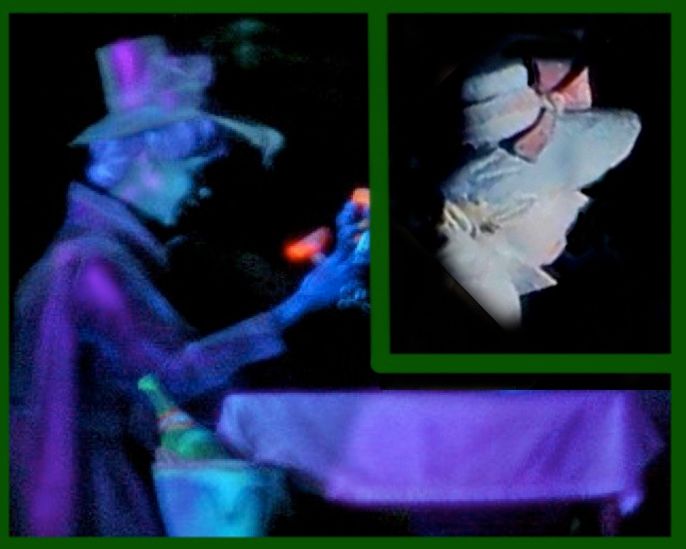
Not all of these quaint and curious upper balcony mysteries are relics from the distant past. Since opening day they have always kept a set of white wicker furniture up there. It speaks nicely of the southern plantation house setting. You can imagine folks sitting out there on a sultry day, fanning themselves, hoping to catch the early evening breeze, lazily waving away flies. It's a little mysterious because you wonder who put that furniture there, and as if to underscore that mystery, a lemonade set appeared one day.
(pic by RegionsBeyond May 2009)
(pic by SilentDante Feb 2013)
I'm not sure when it made its debut. That 2009 photo above is the oldest clear picture of it I've seen, but it may have been there much
longer. However, it's not in any of my 1990s photos, and in the 1980s something else sat on that table, something I can't identify.
I don't know if the lemonade set is "official." (Sometimes Cast Members and maintenance staff get a little happy when no one's looking.) Whatever its origin, it's perfect. Not splashy enough for most people to even notice, and yet baffling for anyone who does. It certainly goes well with the ambiance of the southern plantation house, but who is it for? Who left it there, and why? As usual, you are given no help at all in answering such questions. This is a little random, but it sorta reminds me of those ghost stories where unless you leave a rose in this vase or that place setting at the head of the table or this lemonade set out on the porch, there will be problems with the ghosts. You know, one of those George the Welder things.
Oh, you don't know about George? George the Welder doesn't come from some Victorian ghost tale but actually exists as part of a current legend that some people take seriously. According to the story, a welder named George died in the construction of the POTC ride at WDW, and unless the Cast Members greet George in the morning over the PA when they turn it on and say goodnight to him before they turn it off, the ride will supposedly break down. I don't know whether the story of George is true, but I'm told that it IS true that some WDW Cast Members diligently observe this ritual. Valid or not, the idea behind it is a well-known phenomenon.
Anyway, I'm glad to see the lemonade set is still there, and I hope they intend to keep it there. It would be the last survivor of a series of upper porch props, most of them short-lived, that added a layer of intrigue for those paying close enough attention.
They were things odd and unexplained but not unexplainable,
...and in my book that strikes just the right note. Now, as soon as you've finished your lemonade, there remains one more upper porch mystery that I think is worth knowing about. This one is the oldest of the whole lot, and it's about as long forgotten as they come.
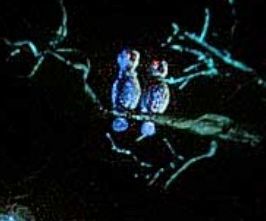
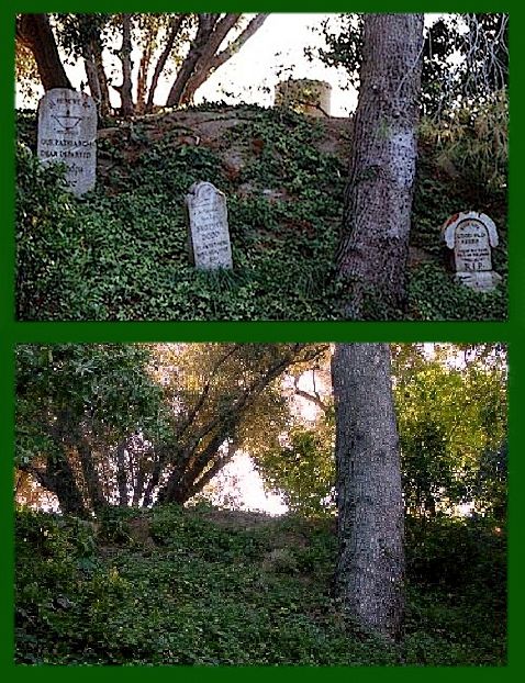
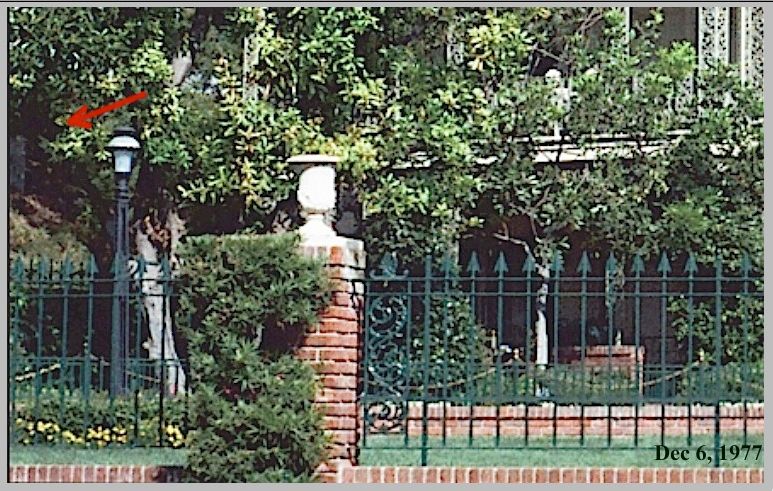
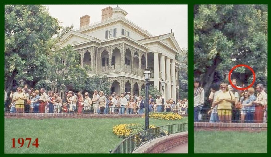
The Birdcage
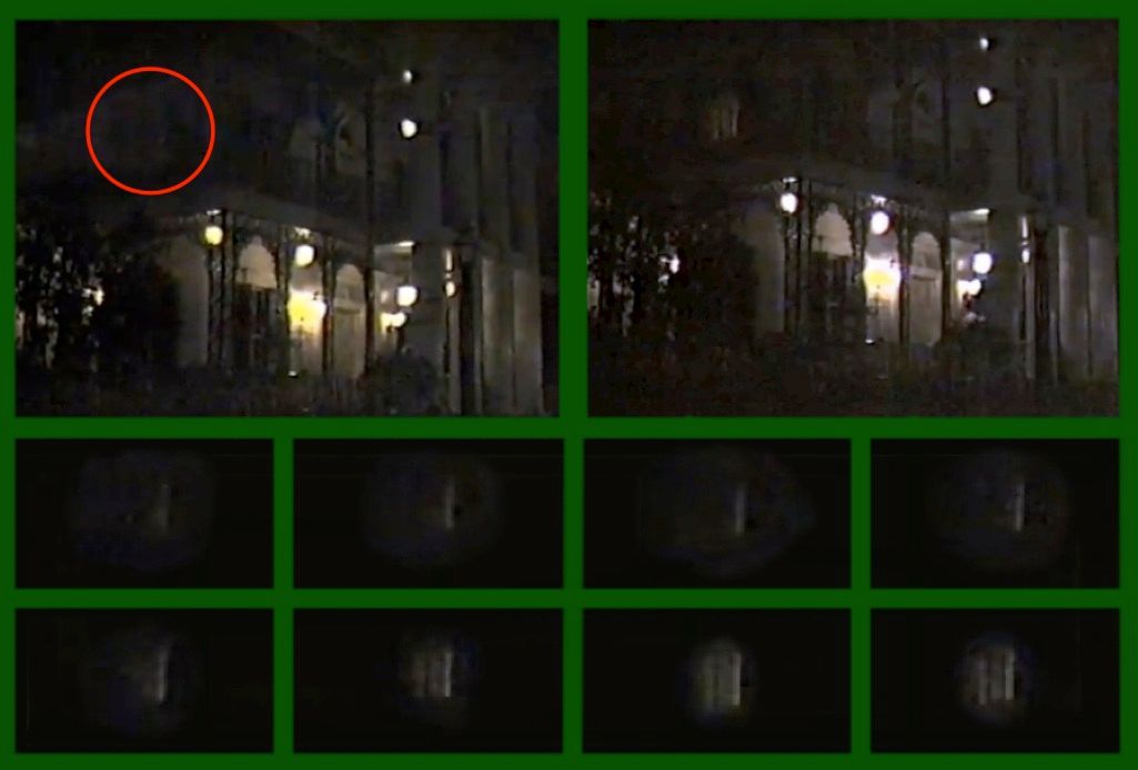
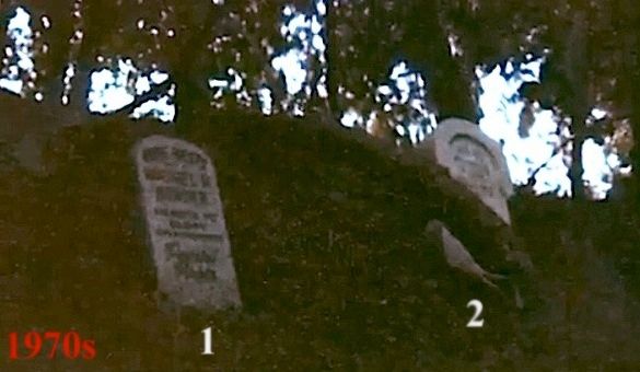
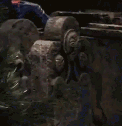
When the Mansion first opened, there was a green birdcage hanging on the southern porch, close to where the lemonade set would be seen many years later. I've only found one half-way decent photo of it, from early 1970:
As you can see, I wasn't kidding about the "half-way" part.
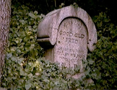
Bad as this next one is, it's my second-best photo of it.
It was there on opening day:
Once you know about it, you can sometimes detect its presence in other old photos——barely.
Then, poof, it disappeared, sometime between September of 1971 and June of 1972, to be precise, and to my knowledge it has never
returned. Oh, and before someone asks, no, this is not the birdcage that's been kicking around in the attic from time immemorial.
The bottom has a different design.
In my opinion, what qualifies this thing as something more than micro-trivia is the possibility that an empty birdcage in this kind of context automatically functions as a metaphor. Did it "feel right" to some Imagineer because it calls up notions larger than itself? (Here you're
supposed to say,"Why, whatever do you mean, professor?" It's right there in the script. Didn't you bring your copy?)
Let's see . . . my pipe, where did I put my pipe? Ah. *puff* Sit, do sit down. Please. Get comfortable. Yes, right there is fine. *puff*
At least as far back as Plato, it has been a commonplace in many philosophies and religions that the body is a prison for the soul. Starting from there, we are told that freedom from the prison is to be found either (1) in this life through some transcendent spiritual experience or philosophical enlightenment, or else (2) only in death. With regard to the latter, grimmer outlook, one of the favorite metaphors for this idea among writers of the past few centuries has been . . . wait for it . . . a bird in a cage, waiting for Death to open the door and allow the spirit to go free. It really is a widespread cliché. It didn't take long to collect oodles of quotes to prove that this is so, but don't feel obligated to read every last one of them; just read until you have reached the point where you are ready to concede that once again your blog administrator is correct, at which point you may skip to the next paragraph. It shouldn't take long. *puff* There's no need to weary yourself.
![]()
![]()
I'm not bothering to provide references, since frankly, they're a bunch of authors you've never heard of (except for Keats: "Most souls, 'tis true..." ). Oh, and there's also this from Victor Hugo in Les Miserables, although it doesn't mention death: "The soul helps the body, and at certain moments raises it. It is the only bird that sustains its cage." If it matters to you, google any line in any of those other quotes and the original context will pop right up.
(Incidentally, the chief nay-sayers to this common outlook have been traditional Jews and Christians who believe in bodily resurrection. We detect a denigration of the physical body in there and a bifurcation of the human being that have never set well with us. Just so you know.)
So here's the big question: Does an empty birdcage, hanging on the porch of a reputedly haunted house, spontaneously function as a metaphor and call to mind this clichéd image for a significant number of viewers, if only vaguely or subconsciously? Or is your blog administrator foolishly chasing phantoms and trying to stuff them into what is just a random, long forgotten prop, placed there by an Imagineer entertaining no such thoughts, not even vaguely or subconsciously? You can tell I'm leaning toward the former, or I wouldn't have wasted so much time on this. This is different from the attic, where a birdcage is covered with cobwebs and thrown in with a lot of other junk; this birdcage is hanging right where it presumably hung when it had a bird in it, and isn't it true that the first thing anyone does upon noticing a birdcage hanging in place is look to see if there's a bird in it? So inevitably it's not just the cage but its emptiness that strikes the viewer.
Some will disagree, but I think that if one sees a conspicuously empty bird cage in situ on the porch of a suspect haunted house, it whispers of death. "The bird is gone. The cage is empty. Another spirit has shuffled off this mortal coil." It may whisper it very low, I'll grant you, but whisper it does. As for what the Imagineer was thinking, that may matter less than we usually assume. We'll take up that question presently.
But first . . . and last . . .
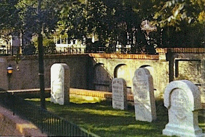
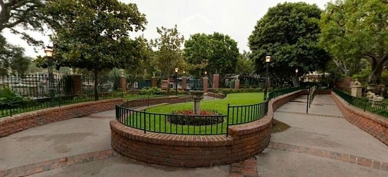
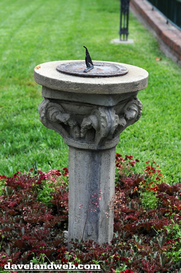
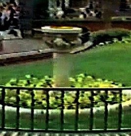
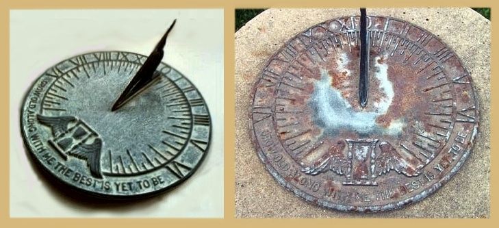
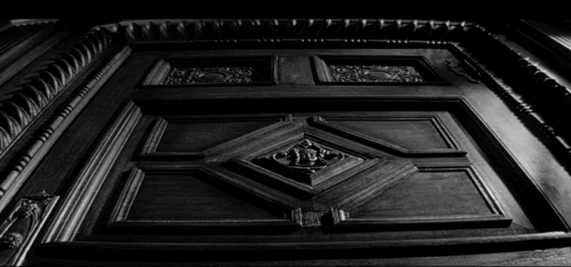
The Sundial
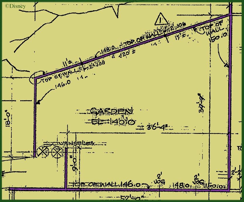
This item could have been part of the previous post, which you will recall dealt with the front yard gardens; and furthermore it's the odd man out in this post, since it's not a porch prop, but the sundial brings up once again the question of intentionality, so I've included it here.
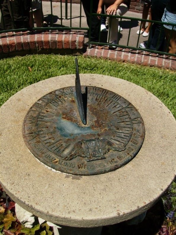
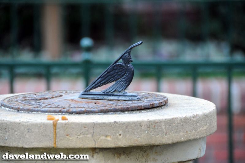
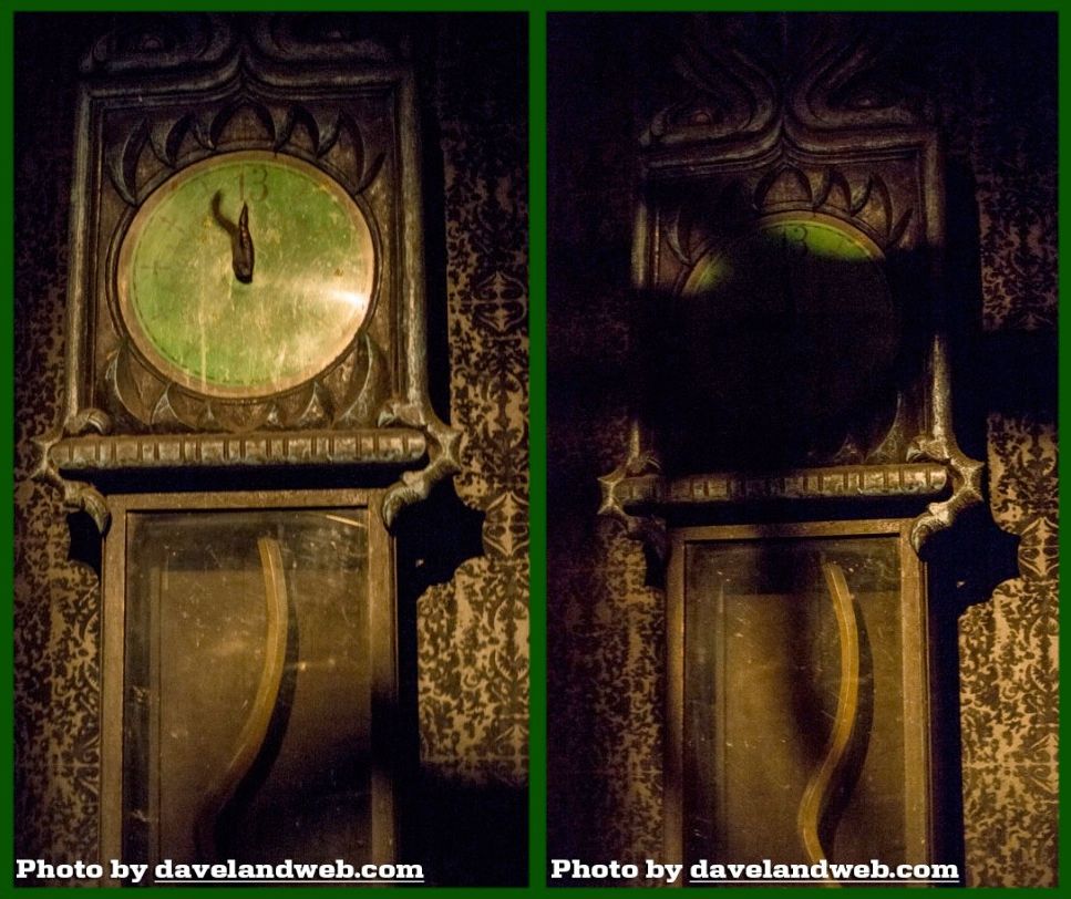
Everybody likes the sundial. It was among the last things added to the grounds before opening day, but it was indeed there, and it has stood undisturbed ever since. Here it is in 1969, not long after the Mansion first opened. If you look closely, it appears that the gnomon is glittering gold, like the gate plaques did at that time. Too bad I don't have a picture of the dial surface itself.
(pic from Mousetalgia)
This grab from a wretched 1974 video shows that it still had some of its golden gleam even then.
With the house painting psychological stratagems we talked about in the previous post, we have something clearly intentional that you are NOT supposed to notice. With the balcony props, we have things that are equally intentional and that you ARE supposed to notice, but they are also intentionally ambiguous, so as to stimulate your curiosity without satisfying it. When we turn to the sundial we encounter something different. The degree of intentionality here is impossible to determine. It's not just a question of what they're trying to communicate, but if they're trying to communicate. Either way, strangely enough, there is undeniably something there that is communicated, because it has writing on it.
![]()
As with the gate plaques, the metal is aging naturally, steadily adding to the sense of antiquity of the house without any effort from anyone. There's a "time flies" symbol on it, and as many have noticed, there is also a motto: GROW OLD ALONG WITH ME, THE BEST IS YET TO BE. After the passage of nearly 44 years, I suppose I could say that yes, I have grown old along with it, as per its request. No wonder it feels like an old friend. All of this is very odd, because I'm not old. (I live by the rule that says "old" is always 15 years older than you are now.)
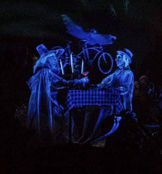
The cheerful motto has always seemed appropriate, since we're going to find out presently that it's one big party in the afterlife. "The best is yet to be," get it? Nice comic irony at work, since out here in this tranquil, sunny garden, who could possibly anticipate that "the best is yet to be" is soon to be justified in such a brash and boozy, lampshade-on-the-head manner?
But here's the thing. If you do even that much with that motto, you don't know if you've gone beyond the Imagineers' actual intentions when they put the sundial there. As a result, you may conclude in despair that you cannot tell when you've started to "make something out of nothing," and you may then decide to give it all up rather than risk making a fool of yourself. Just stick with me here; it'll get clearer.
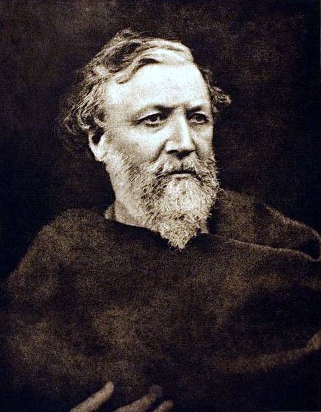
Robert Browning
The motto is from the opening stanza of Robert Browning's poem, Rabbi Ben Ezra. Ben Ezra was something of a Renaissance man back in the medieval period, and Browning evidently admired his spirit as someone who knew how to live his life rather than hang back and play it safe, like so many of us do. "Seize the Day" is okay, but ol' Bob here thinks it's too narrow: embrace the whole sweep of your life, the good and the bad. The full stanza is actually a pretty well-known snippet of Victorian verse:
Grow old along with me!
The best is yet to be,
The last of life, for which the first was made:
Our times are in His hand
Who saith "A whole I planned,
Youth shows but half; trust God: see all, nor be afraid!"
That really is a fine piece of poetry right there, and it's often reprinted just like that, as if it were the entire poem. Unfortunately, it isn't. Rabbi Ben Ezra goes on in dense, didactic fashion for another 31 stanzas that don't really add much to what has already been said (in my opinion; apologies to Browning lovers). There's nothing biographical about Ben Ezra himself in there to provide relief; he's just a symbolic title for a topic Browning wishes to expound——and expound and expound. I suspect that Rabbi Ben Ezra in its entirety is little read these days.
So when you're reading the sundial in front of the Haunted Mansion, you're actually reading an excerpt from an excerpt, which introduces our first ambiguity. Is that motto supposed to evoke the whole first stanza in the reader's mind? Is it an allusion, in other words? Probably; that first stanza is a famous poem. Okay, but was the sundial designer pointing us to the whole 32 stanza poem? Is it legitimate, for example, to find in his sundial a possible allusion to "Time's wheel" in stanza 28 or perhaps to "earth's wheel" in stanza 30? Uh...well...that's harder to say.
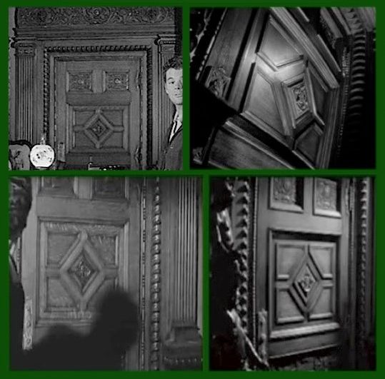
And the murk only gets murkier. The Mansion's Imagineers did not create this sundial. It's an off-the-shelf design. In the comments, reader EvilRocketeer identified it as a Virginia Metalworkers model 23-1 sundial. Here's one of those alongside the Disneyland specimen.
![]()
Now the options for intentionality really get blown wide open. At one end of the scale, maybe someone in charge of the HM landscaping, in a desperate hurry at the beginning of August '69, flipped through a catalogue and said, "Okay, here. That one. That'll do," handed the catalogue to an assistant, and never even noticed that there was something written on it. At the other end of the scale, we may imagine an Imagineer who is vice president of the Robert Browning Appreciation Society and can recite all 32 verses of Rabbi Ben Ezra by heart, and this is a moment he's been eagerly anticipating from the beginning of the project. Or let's go for something in between: Imagineer Joe notes that the motto on this particular sundial is vindicated in an unexpectedly comic manner in the HM and says, "Perfect! Get it." Or maybe Imagineer Jack thinks that the gnomon design goes nicely with the "bird of paradise" wrought iron design that decorates the house, and so this sundial gets the nod.
![]()
I realize that I may be the only person on earth who can make a problem out of looking at the sundial in front of the Haunted Mansion,
but admit it, you're sucked in now. Don't worry, your blog administrator is not going to leave you out there like orphans in the snow.
Intentionality: Who Needs It?
*puff*
*puff*
The running assumption throughout these analyses has been that if WDI did not intend it, it doesn't exist. It's a make-believe world, and what is and is not "real" in that world is determined by its creators (and owners, not quite incidentally). When it comes to Disneyland, everything you see is whatever Walt Disney Imagineering says it is, period. Right?
Having spent more time than I care to admit in the world of academia, I can tell you that there is another view of these things, quite the rage at present, and often linked with the term "post-modern" (which doesn't clarify things much, IMO). The discussions are usually with regard to authors, texts, and readers, but the ideas are easily transferable to artists and musicians and Imagineers and their audiences. According to this other view, inquiring after an author's intention is a fool's errand. In many cases, the author is dead and cannot be consulted, and his/her intention is unavoidably a question of interpretation—by the readers. The text (or artwork, or song, or sundial) is released into the world, and baby, it's on its own. The author doesn't own it anymore (with regard to meaning, presumably, not royalties!). "Meaning," we are told, is created in the viewers' minds as they look at the work; it isn't in the text itself (which is just black squiggles on paper) or the artwork itself (just dabs of paint). Authors and artists cannot control how people are going to react to their creations——self-evidently so if they are dead and a lot of time and cultural change has flowed under the bridge.
In its more radical forms, this line of thought gives birth to declarations like, "One interpretation of a text must be presumed as valid as any other," and "There is no fixed 'meaning' in any text," and "There is no objective 'truth'; only my truth or your truth or their truth." It is explained that we each read texts from different social locations, and it is this that determines the meaning of the text for each of us, and furthermore, that's exactly the way it should be.
I had several professors who were enthusiastic passengers on this train. In a small group discussion one time, I was foolish enough to ask one of them if instead of Deuteronomy or the Gospel of Matthew I might apply my personal notions of truth and meaning to the text known as "Teaching Contract," seeing as how it too was a text, and my reading of it should be as valid as anyone else's, and I had been given to understand that there was no need to concern myself with the author's intent. I got a dirty look and was told that obviously, that was a completely different thing.
Having said that...
Just because I don't buy into this view in its entirety and in its most radical expression doesn't mean I don't think there are some valid points to it. Remember this, from Fantasia?
You know, it's funny
There are other examples of this kind of "funny." Artist Georgia O'Keeffe did a series of large canvases consisting of realistic close-ups of flowers. Everyone in the world thinks they have an erotic quality to them. Everyone, that is, but Georgia O'Keeffe, who always insisted that she had no such intentions.
Stop staring, you perv. Have you no shame? If you're still not convinced, this should do it: Reportedly, Elvis Presley thought "It's Now or Never" was his best song. No, seriously. The point is, artworks do have an objective, independent existence, and whether by luck, ineptitude, stupidity, subconscious impulse, or the influence of the Muses, they can give an impression shared by a large number of people that the artist never consciously intended, a perception in some cases so compelling and widespread that resistance is futile. "Everybody knows" that painting X means Y. It's a fact on the ground, and there's not a damn thing the artist can do about it now.
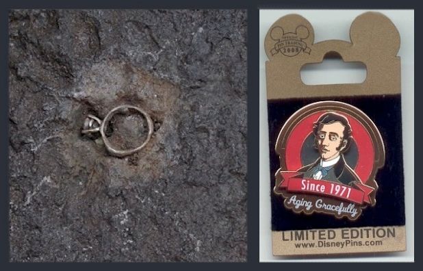
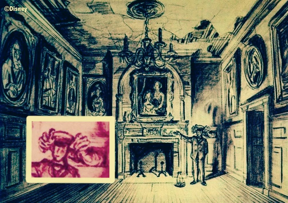
There are at least two cases where something similar to this has occurred at the Haunted Mansions: the "bride's ring" at WDW that was nothing but a cut-off pipe, and the identification of the man in the Dorian Gray-like painting as "Master Gracey." So strong was the popular presumption that those two interpretations were correct that WDI eventually caved and gave its blessing to both. So once in awhile it can happen that authorial intent is sidelined or superseded. In the case of the ring, meaning was created where no one had intended to say anything at all. People "made something out of nothing," and that Thing eventually prevailed over the naysayers.
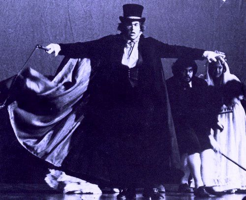
"It's . . . ALIVE!"
![]()
.![]()
. ![]()
My beef with the "post-modern" view is not that it's utterly wrong but that they're taking something that is exceptional and trying to make it the norm, something universally applicable or very nearly so. Not only does that go against common sense, but in their heart of hearts even its proponents don't quite believe it when it seriously matters, when things get real, as they say, like with teaching contracts.
I think that THE BEST IS YET TO BE on the sundial at Anaheim's Mansion would strike enough people as amusingly ironic and wittily appropriate that such a reading has a pretty good claim to validity regardless of WDI's intent, which is unknown in this case and probably always will be. I won't insist quite so strongly for the empty birdcage as a metaphor of death, but I believe that this too would have a decent claim if the cage were still around. Too bad it isn't. It was a cool prop.
Whoops, there's the bell.